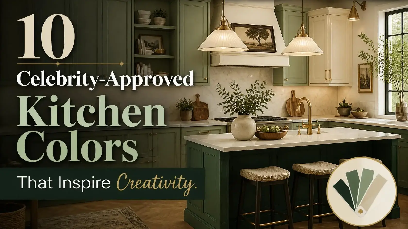
Color can make a kitchen feel warmer, brighter or more personal. Celebrity home tours offer useful examples, but a photograph is not proof that a particular paint shade will work in every room. Here are ten adaptable kitchen palettes, including looks documented in the homes of Kim Kardashian and Dakota Johnson, along with practical ways to test each idea.
Quick Answer
For a celebrity-inspired kitchen in 2026, begin with colors that suit your light and cabinet materials. Dakota Johnson’s green kitchen, documented by Architectural Digest, suggests a rich natural palette, while Kim Kardashian’s home shows the appeal of quiet cream and white. Other useful choices include sage green, mushroom beige, warm white, coastal blue, oak, greige, two-tone cabinetry and blue-gray. These are design ideas, not claims that every shade was personally endorsed by a celebrity. Test samples at different times of day, compare them against countertops and floors, and check finishes before committing.
What celebrity home tours actually show
In a home feature and tour, Architectural Digest identifies Dakota Johnson’s kitchen cabinetry color as Benjamin Moore Alligator Alley. Its muted green adds depth without requiring every wall and surface to match. The publication also documented Kim Kardashian’s predominantly cream home and two-kitchen layout. These are published examples, not a comprehensive endorsement list for specific paint products.
A cabinet color can look different when photographed under studio lighting or edited for a magazine. Use famous interiors as a starting point for your own mood board. A practical decision should still account for kitchen size, natural light, fixed surfaces and the cost of repainting.
Ten kitchen color ideas to adapt at home
1. Muted sage green
Sage green feels calm without fading into gray. Try it on lower cabinets or an island, then pair it with cream walls and natural wood. If your room faces north, compare warmer and cooler sage samples because the undertone can shift noticeably. For examples, see this kitchen inspiration collection and study images under different lighting conditions.
2. Warm cream
Cream can soften an all-white room and pairs well with oak and honed stone. Kardashian’s restrained interiors are a recognizable example of neutral layering, although they should not be copied as a one-size-fits-all kitchen plan. Use variation in texture so the room does not look flat.
3. Deep green
Johnson’s kitchen is a helpful real-world reference for green cabinetry. In a smaller kitchen, consider a deep green island or lower row rather than coating every wall. Balance it with a light backsplash and check how the color reads after dark under your kitchen’s own bulbs.
4. Mushroom beige
Mushroom beige sits between gray, taupe and brown. It works especially well beside warm stone, aged brass and walnut. Paint two sample boards rather than guessing from a web image: the color may lean pink or green depending on surrounding materials.
5. Warm white
Off-white cabinets make a good backdrop for colorful dishes and artwork. Look for an undertone that complements existing countertops and trim. Bright white can read cool in some rooms, while creamy whites may seem yellow next to icy marble.
6. Light coastal blue
A soft blue is a gentle way to introduce color when you do not want dark cabinets. Try it with nickel hardware, white tile and pale wood. Test the shade against your kitchen windows; strong daylight can make pastel blue feel much lighter than a paint chip suggests.
7. Natural white oak
Wood is a material rather than a paint color, but natural white oak deserves a place in a kitchen palette. Its grain introduces warmth and texture. Use a clear or lightly tinted finish and sample the sealant before installation, since protective coatings can change the tone.
8. Soft greige
Greige is useful when you want a neutral with slightly more depth than cream. Pair it with dark accents or a wood island for contrast. Judge the sample next to the floor, which often makes its gray or beige undertone easier to see.
9. Two-tone cabinet colors
Two-tone kitchens combine two finishes rather than depending on a single shade. A pale upper row and darker base cabinets can create visual balance. Keep the countertop and backsplash simple so the extra contrast feels intentional, not busy.
10. Pale blue-gray
Blue-gray is restrained enough for traditional kitchens and contemporary spaces. It works with white quartz and brass or nickel accents. If your kitchen has limited daylight, look for a slightly warmer version so the cabinets do not turn steely or cold.
How to choose a shade for your kitchen
Choose a palette around the surfaces that will stay: floors, countertops, appliances and window frames. Take cabinet samples into the actual room and look at them in morning, afternoon and evening light. Color matching on a phone screen is too unreliable for a permanent decision.
Consider the finish as carefully as the hue. A matte cabinet can conceal reflections, but cleaning and durability depend on the coating and product instructions. A more reflective finish may emphasize imperfections. If you need a broader starting point, compare kitchen color guides before narrowing your choices to two or three samples.
What to verify before copying a celebrity look
Do not treat an online caption such as ‘celebrity-approved’ as evidence of a brand partnership or explicit recommendation. Look for a published home tour, designer interview or first-hand photo description. Even a genuine celebrity kitchen photo may not name the exact paint color, hardware finish or material supplier. If a brand is not independently identified, it is better to describe the visual style than invent a precise product name.
Final thoughts
The useful lesson from celebrity interiors is not that there is one fashionable color for every kitchen. Johnson’s green cabinetry and Kardashian’s neutral home show two contrasting approaches. Your room’s light, daily use and existing finishes should make the final choice. Sample first, decide second and use celebrity images as inspiration rather than as a specification sheet.